Hollywood Blvd. News – Los Angeles Clippers Edition
- Updated: July 19, 2015
(Photo via Twitter User @ArashMarkazi )
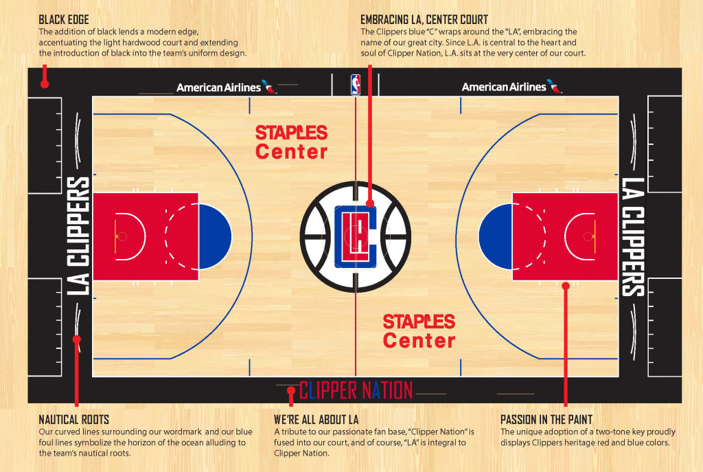
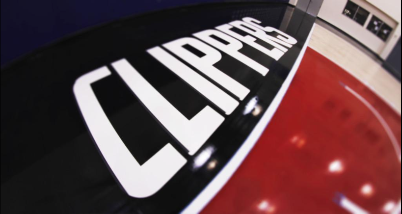
On Friday, the Los Angeles Clippers released the designs for their new court!
The Clippers are taking this offseason to rebrand and re-design the team and although there are still mixed feelings about it, it’s being talked about all over the league!
Personally, I am a big fan of the new logo and the uniforms. I think it really separates them from the Lakers, and they can finally be their own team. Although, people will always hate on the Clippers, just because they are the Clippers.
NBCSports.com describes their opinion on the following aspects in their article covering the reveal:
“Overall, it looks pretty sharp. The red and blue paint by the baskets pops next to the black on the sidelines, and the “CLIPPER NATION” at midcourt is a nice touch. It’s just…that new logo. It still feels like they could have done so much better. A rebranding was the right idea, to distance themselves from three decades of Donald Sterling-helmed embarrassment. But they’ve dropped the ball on the logo and the uniforms, and for all its merits, the new court is the latest reminder of that.”
The Clippers have had a very impressive offseason with the acquisition of some big players like Josh Smith, reclaiming DeAndre Jordan, Paul Pierce, Brandon Dawson, Lance Stephenson, Cole Aldrich (and many more). It will be interesting to see how that all plays out. The Clips will truly have a fresh start, in every way possible.
Check out the images below of the new court:
Here's your first look at our all-new court for the 2015-16 season → http://t.co/2BafD6xmQN #ClaimYourCourt pic.twitter.com/p6ZGC0f5TZ
— LA Clippers (@LAClippers) July 17, 2015
And this video:
Who's excited to see @blakegriffin32 & @deandrejordan6 throw down dunks on this awesome new court? #ClaimYourCourt https://t.co/OI5cLRjGuA
— LA Clippers (@LAClippers) July 17, 2015
What do you think? Let us know!
Stay with us at Calisportsnews.com as we will keep you up-to-date on all things Los Angeles Clippers and the rest of the LA sports teams! All Cali, All the time!

